Spirit Airlines Rebrand
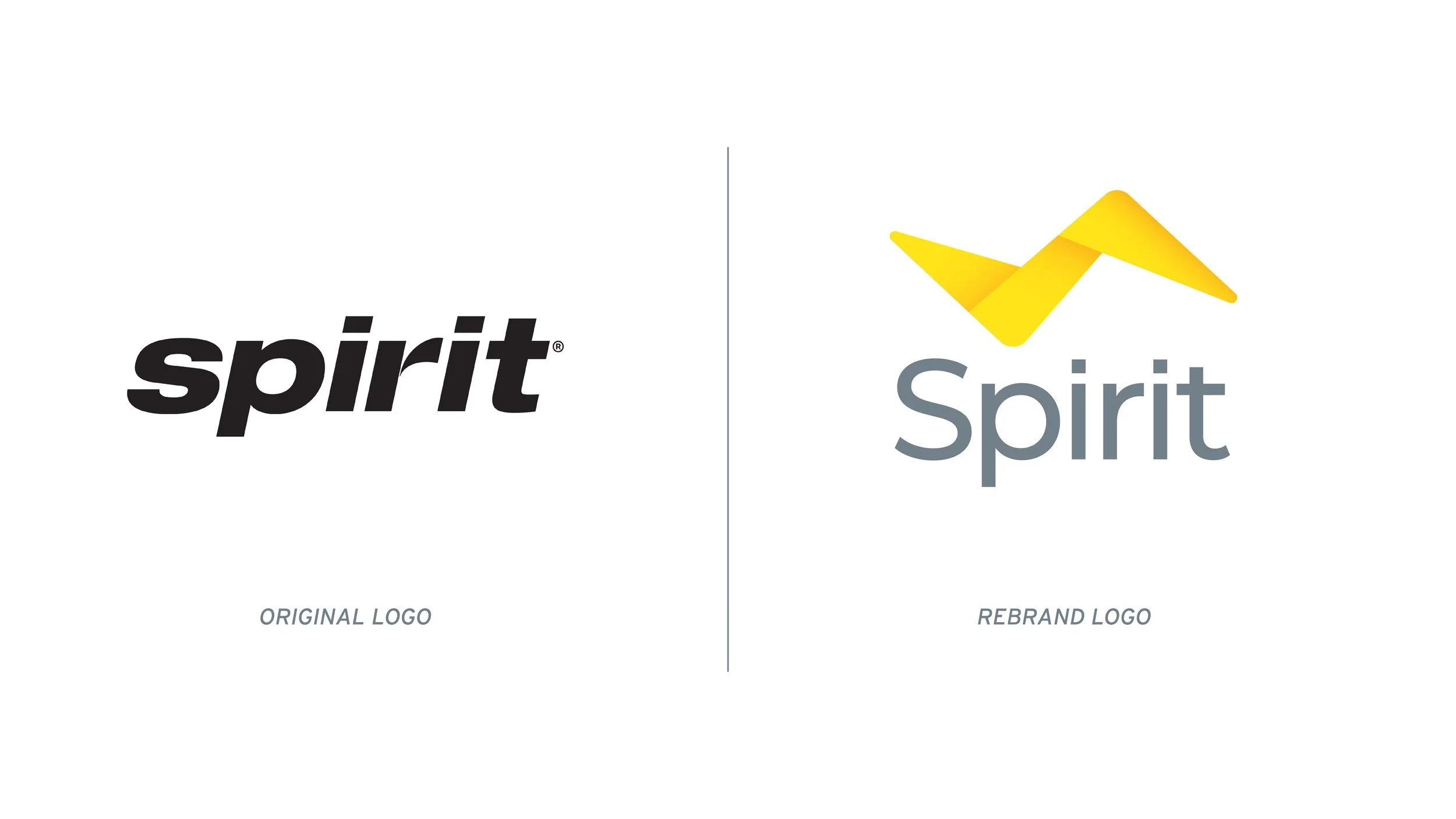
Spirit Airlines is known for being a “low-cost carrier”, with cheaper pricing in comparison to its competitors. The rebrand for Spirit Airlines focuses on rebuilding the brand’s reputation and making the brand a competitor to other well-known commercial airlines. The objective was to reinforce Spirit’s point of differentially – being a low-cost airline – while changing the narrative behind customer opinions of the brand.


The Creative Process
Spirit Airlines is known for being a “low-cost carrier”, with cheaper pricing in comparison to its competitors. The airline’s business model focuses on providing lower plane tickets and charging for extra amenities. The brand is known for being the rebel of the airline industry, and it stands out as having a younger, bolder, and more vibrant personality in comparison to other commercial airlines. This is largely due to its playful logo and brand identity that doesn’t convey the same reliability as its competitors.
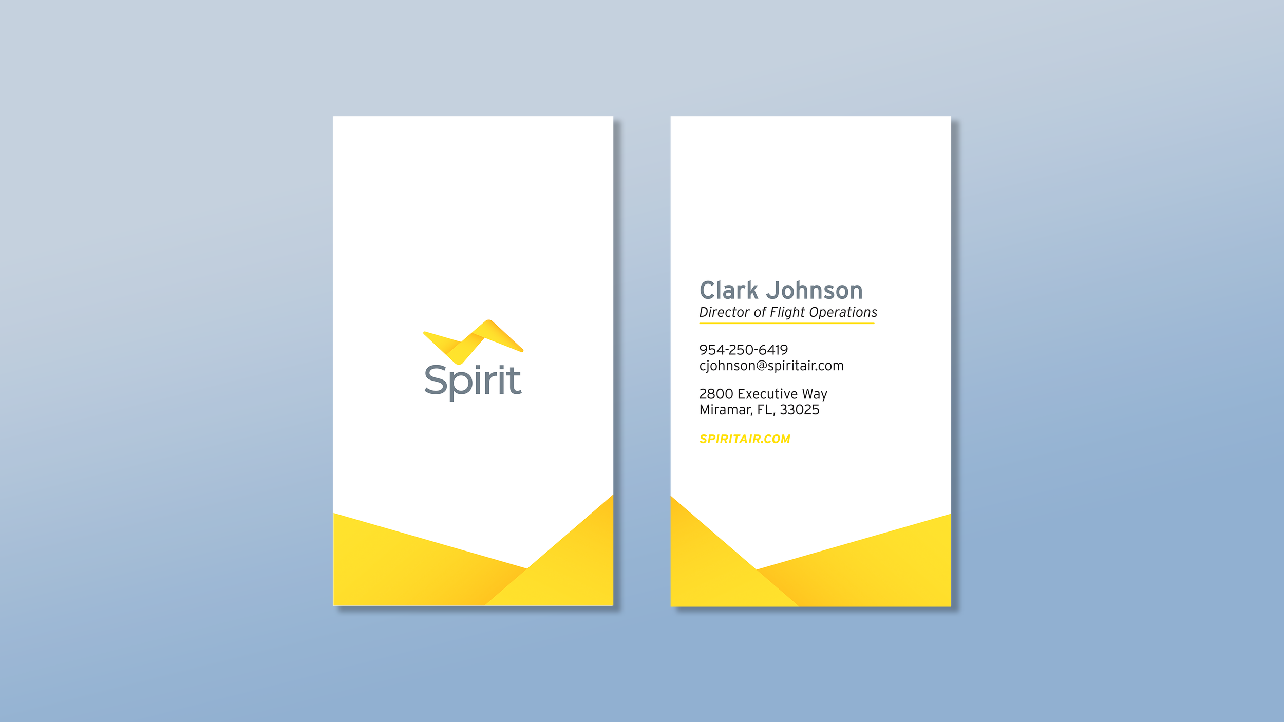
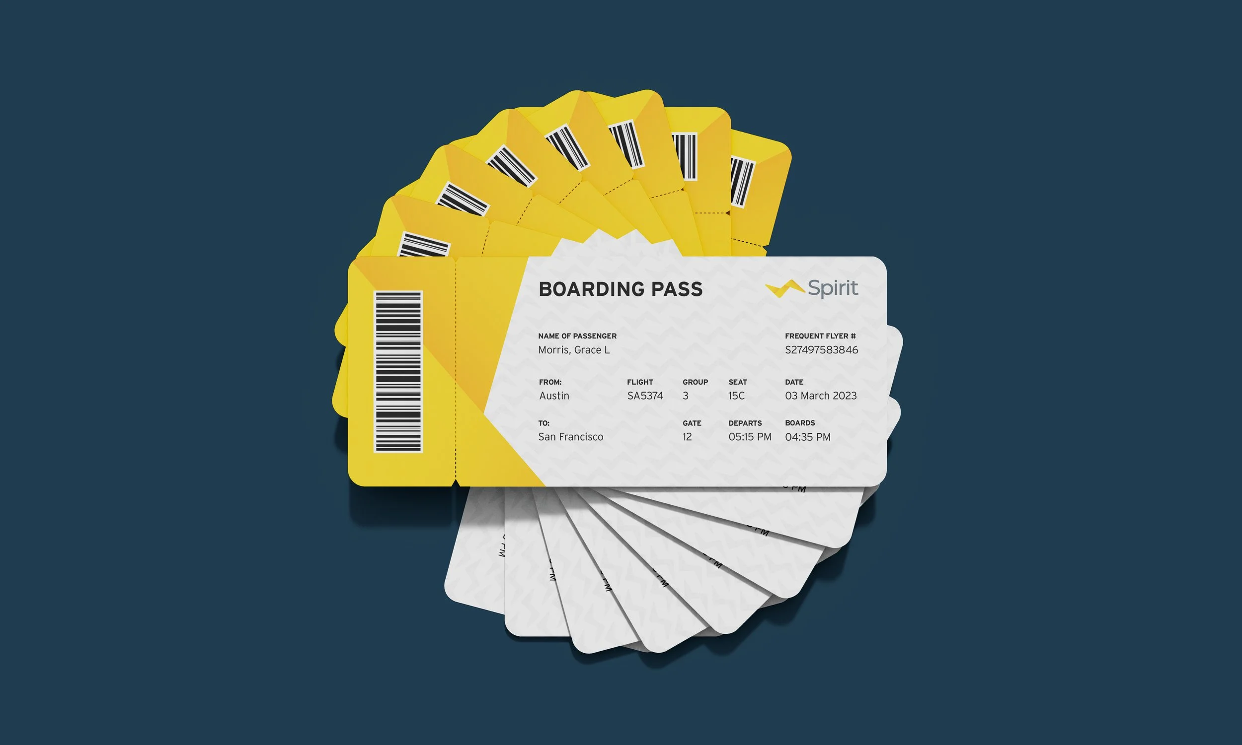
The rebrand for Spirit Airlines focuses on rebuilding the brand’s reputation and making the brand a competitor to other well-known commercial airlines. Spirit Airlines currently doesn’t have a recognizable logo symbol besides the yellow “S” from the wordmark, so providing the brand with a recognizable icon helps to establish credibility and reliability for the brand. One of the largest objectives with Spirit’s branding is to reinforce Spirit’s point of differentially – being a low-cost airline – while changing the narrative behind the customer opinions of the brand. This was done by the intentional inclusion of an icon that reflects subtle iconography of origami and the shape of the bird. The logo is composed of three main parts that give the logo depth and convey the movement present in flying. The structured nature of the logo increases the reliability and creates a comfortable feeling associated with Spirit Airlines.

